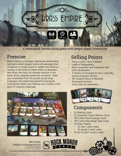
I got a lot of praise for a recent sell sheet I put together for Brass Empire, so I thought I would share my process and delve into the subject a bit.
What is a Sell Sheet?
A sell sheet is a one-page document that conveys the core gameplay, theme, and important details of your game. They are often given out to publishers in the hopes that the publisher will take a closer look at the game and potentially publish the game. Sell Sheets aren’t just for publishers though. Distributors use them to send a quick overview of new games to retail stores and you can also use them at trade shows and other conventions.

The important thing about a game sell sheet is that it draws whoever is looking at it in so that they read it and learn the basics about your game. A Sell Sheet should always include basic info on length of play, number of players, age recommendation, highlight special features and gameplay mechanics, and never forget your name and contact information.
No matter who you are gearing your sell sheet towards, it is a marketing tool that should represent your game to the best of your ability.
How do you make a Game Sell Sheet?
I made my sell sheet in Adobe InDesign, but there are plenty of other programs that you could use (Inkscape, Word, Publisher, Illustrator etc). I would recommend that you stick with a program that you already know; You want to be comfortable laying out all your information and images. I would say that I’m much stronger at graphic design/layout than the actual writing of a sell sheet, so I’ll point you towards these helpful resources for additional insights into the writing of content:
Laying out a Sell Sheet
I want to point out that Brass Empire is my first tabletop game and while I have a lot of experience in Adobe InDesign, this is the first board game sell sheet I ever made so I definitely wanted to collect some feedback before I headed off to Origins.

I shared my draft on the Card and Board Game Designers Facebook Group and got a lot of great feedback. I would definitely recommend that you share your sell sheets with this group and/or any others that are involved in the industry.
I want to take a moment to breakdown the layout and design of this sell sheet since I feel that a lot of the examples that I have seen online have great content, but lack panache in the presentation department. I would argue that the design and presentation is as important as the content. Furthermore, if your presentation looks amateurish, crammed with text and/or unattractive, people may never even bother to read your content – no matter how good your prose.

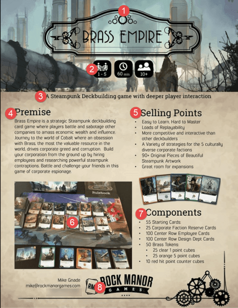
- This upper portion is actually my favorite part of the sheet. It displays the game’s logo and some art which I feel evokes the theme well.
- I consolidated most of the important information (game duration, players, age group) right here in logos similar to those found on game boxes.
- One sentence hook – I tried to boil down everything into the game into this one sentence/subtitle.
- Premise – this is a paragraph that gives a quick description and overview of the game.
- Selling Points – this is the list of features / highlights etc. which distinguish the game. I revised this portion a lot based on feedback (see below).
- Picture of your game / prototype. I actually wish I had time to take a more professional photograph for this part, but I was under a time constraint. Needless to say the picture isn’t the strongest, but this is an essential element that everyone should include.
- Components – I simplified this down based on some nice feedback as well, but including a short bulleted list of what comes in the box is helpful for retailers, publishers and players alike.
- Contact information – Don’t forget your contact information!
The above list shows off all the important elements that should be included on a sell sheet, but it’s important that readers can quickly glance at your sheet and find the information that they are looking for. Make sure that the information in #2 pops out from the rest of the text and page. In general, keeping the text to a minimum is important and oftentimes a hard rule for game designers to follow. Save your longer explanations for your pitch. Remember that the sell sheet is just a tool to get your game idea across at a quick glance and hopefully be memorable to the reader so they go out seeking more information or contacting you about a publishing deal.
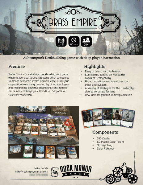
Once I posted my draft to Facebook, it became my most commented thing I’ve ever contributed. I got a lot of great tips and made several tweaks before I departed for Origins.

It is definitely better overall, but could still use a better photo of the components. The crazy thing about this whole process was that when I handed out my sell sheet at Origins there were quite a few people that remembered seeing it online and complemented me on its overall design and professionalism.
I think a big part of the memorability and impact of the sell sheet is the artwork that I used to convey the setting and the overall polish of the logos. I just want to mention that I am not an artist and while I was lucky enough to have artwork from my game commissioned already, you can still put together a sell sheet like this one with minimal investment. First off, my game’s and my company logo are from fiverr.com and I spent no more than $50 on each piece. I did have a piece of commissioned artwork (which you could certainly obtain from an artist online), but you could just as easily use images that you find on Deviant Art or somewhere else on the internet that conveys the feeling/theme of the game to publishers; just remember to ask the artist’s permission or give him credit. The point is that even if you count the cost of the logos and artwork, this sell sheet was done cheaply. The background textures, borders, player, time, and age logos were all found online for free.
If you want to see more board game sell sheets, you can see more examples on these posts:
- http://www.leagueofgamemakers.com/sell-sheets-for-game-designers-101/ (tons of samples – Boomtown Bandits stands out to me)
- https://inspirationtopublication.wordpress.com/2010/10/03/step-14-create-sales-sheets/ (good tips on writing – ugly sell sheets)
Please feel free to message me on Facebook if you would like help or feedback on your own sell sheet.

Leave a Reply